
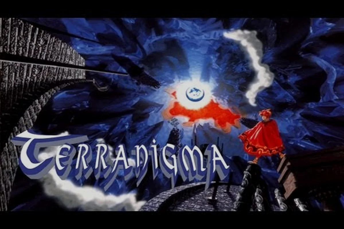
The terranigma intro video remains one of the most haunting openings on the Super Nintendo, and it matters now more than ever because the August 2026 Pixel Arcadia announcement brought the game back into the spotlight. Watching Ark step through that forbidden door sets the emotional tone for the entire journey, while the closing cutscene recontextualizes everything you thought you understood about sacrifice and rebirth. This guide walks through both cinematic bookends, then unpacks the visual language that makes Quintet's 1995 action RPG feel timeless.
The Opening Sequence as Visual Thesis
The terranigma intro video wastes no time establishing a world split between a hollow, internal Darkside and a surface Lightside. According to the official Terranigma Steam page, the Earth is literally a hollow sphere, and the intro lingers on Crysta's dim blue interiors before Ark ever touches the forbidden door. That contrast between enclosed village life and the unknown surface is not just worldbuilding; it is the core visual argument of the entire game.
Scene-by-Scene Breakdown of the Cold Open
The opening cutscene runs roughly two minutes, but every shot is loaded with narrative weight — a direct consequence of Kamui Fujiwara’s character design philosophy, where even background silhouettes carry arc-relevant implications rather than decorative filler. The sequence wastes no frames on pure exposition; instead, it layers environmental storytelling (the decaying lab equipment, the frozen surface world glimpsed through cracked monitors) beneath the kinetic action beats. Here is a table breaking down the major beats and what each one signals:
| Sequence Beat | Visual Element | Narrative Purpose |
|---|---|---|
| Crysta waking shot | Blue-toned interiors, low contrast | Establishes the Darkside as sheltered, almost womb-like |
| Ark's morning routine | Warm lamp light against cool stone | Contrasts domestic safety with the unknown beyond |
| The forbidden door | Deep shadows, angled framing | Creates tension before any dialogue explains the taboo |
| Yomi's release | Sudden red and black burst | Shifts the palette from calm to catastrophe in seconds |
| The five towers rising | Wide exterior shots, bright sky | Promises the resurrection quest that will follow |
The intro's pacing is deliberately slow for the first ninety seconds, which makes Yomi's eruption feel violent by comparison. Community discussions on the r/Terranigma subreddit frequently cite this tonal whiplash as the reason the opening sticks in memory decades later.
How the Intro Teaches Without Tutorials
Quintet did not include a modern tutorial overlay in the terranigma intro video, but the sequence still teaches players how to read the game's emotional stakes. Environmental storytelling does the heavy lifting: the villagers' muted colors contrast with Ark's brighter sprite, marking him as the agent of change before a single line of dialogue lands. Silhouette blocking frames Ark against doorways repeatedly, reinforcing the threshold motif that defines the story's structure.
The intro also introduces the game's signature pixel lighting technique, where warm and cool colors alternate to signal safety versus danger. That same technique recurs in the ending cutscene, which makes the visual bookends feel like a deliberate, authored pair rather than a coincidence of hardware limitations.
The Ending Cutscene and Its Emotional Payoff
The terranigma ending cutscene is famously ambiguous, and players still debate its meaning in community threads. Ark's sacrifice, the fate of the surface world, and the final image of the bird all carry interpretive weight that the intro only hints at. What makes the ending land so hard is that it returns to the same visual motifs established in the opening: thresholds, light sources, and the relationship between Ark and the natural world he resurrected.
Symbolic Continuity Between Opening and Closing
The ending does not introduce new visual language so much as it completes the patterns the terranigma intro video set in motion. Where the opening shows Ark's village of Crysta frozen in a painterly stillness—soft ochre light, the bell tower's silhouette against a muted sky, and the slow camera drift that mirrors a half-remembered dream—the closing sequence returns to that same palette and pacing, but now with the weight of consequence: the village has been reborn, and the camera lingers on the same architectural landmarks to confirm that the world Ark sacrificed himself for is visually identical yet emotionally transformed. Kamui Fujiwara's character art reinforces this symmetry, as Ark's final pose in the ending cutscene deliberately echoes his first appearance in the intro video, down to the angle of his head and the fall of his cloak. The effect is not repetition but closure: the intro's unanswered visual questions—what lies beyond the mountain ridge, why the bell tolls alone—are resolved frame by frame in the finale, making the two bookends read as a single, continuous shot across the entire game.
| Visual Motif | In the Intro | In the Ending | Meaning Shift |
|---|---|---|---|
| The forbidden door | A source of catastrophe | A threshold of sacrifice | From transgression to atonement |
| Warm vs. cool light | Safety inside Crysta | Dawn breaking over the surface | From shelter to exposure |
| Ark's silhouette | Framed against doorways | Small against the horizon | From curiosity to humility |
| Natural imagery | Mostly absent | Birds, sky, open water | From artificial to living world |
This symmetry is one reason the terranigma ending cutscene feels earned rather than tacked on. Players who watch the intro and ending back-to-back often report noticing details they missed on a first playthrough, according to community data shared in the subreddit's nostalgia threads.
What the Final Frames Leave Unanswered
The ending refuses to spell out whether Ark survives, what happens to the resurrected humanity, or whether the cycle will repeat. That deliberate ambiguity is part of the game's thematic argument about growth and decline, a concept the story explores through every continent Ark revives. The terranigma ending cutscene trusts the player to sit with uncertainty rather than forcing a tidy resolution.
This openness has fueled decades of interpretation, and the August 2026 re-release announcement only intensified the conversation. Players returning to the game for the first time in thirty years bring fresh readings to the same ambiguous frames, which keeps the ending alive as a piece of art rather than a solved puzzle.
Kamui Fujiwara's Character Design Language
The terranigma kamui fujiwara art style is inseparable from the game's identity, and the artist's involvement in the upcoming re-release was confirmed in Siliconera's report on the Pixel Arcadia announcement. Fujiwara's character work balances simplicity with expressiveness, using bold silhouettes and restrained color palettes to make every NPC readable at a glance.
Signature Elements of Fujiwara's Approach
Fujiwara's terranigma character design art relies on several recurring techniques that distinguish it from other 1995 SNES RPGs. Most notably, he avoids the chibi-proportioned sprites common to contemporaries like Chrono Trigger or Seiken Densetsu 3, instead elongating Ark's limbs to a nearly teenage ratio — a choice that pays off in the terranigma intro video, where the protagonist's silhouette must read clearly against the shimmering underworld backdrops during the resurrection sequence. Fujiwara also layers costume details (Ark's asymmetrical pauldron, Elle's braided hair loops) so that even at 32×48 pixel resolution, each character retains a unique contour when the terranigma ending cutscene cycles through its emotional close-ups. This silhouette-first philosophy echoes the terranigma concept art sheets, where characters are sketched in pure black before color blocking begins.
-
Facial economy: Characters communicate through eyebrow angles and mouth shapes rather than detailed features, which keeps sprites legible at small sizes.
-
Costume storytelling: Ark's simple tunic contrasts with the ornate robes of Crysta's elders, signaling his outsider status without dialogue.
-
Color zoning: Each major character carries a single dominant hue, making them instantly recognizable in crowded scenes.
-
Silhouette priority: Even in black and white, Fujiwara's characters are distinguishable by their outlines alone.
These choices explain why the terranigma character design art holds up when many contemporaries feel dated. The restraint is the point: Fujiwara strips characters down to their narrative essentials, then lets the animation and lighting do the emotional work. In the terranigma intro video, for instance, Ark's muted tunic and simple silhouette read instantly against the glowing crystal box, while Elle's minimal facial features still register grief through a single tilted head angle. The palette discipline — ochres, umbers, and that signature cobalt shadow — means every costume change in the terranigma ending cutscene lands as a deliberate story beat rather than cosmetic flair, which is precisely why the terranigma concept art scans as production design, not mere sprite dressing.
Concept Art and the World It Built
The terranigma concept art for environments shows a similar philosophy applied to spaces. Early sketches of Crysta emphasize verticality and enclosed arches, while Lightside concepts open into wide plains and towering structures. The contrast is baked into the world design from the first pencil lines.
According to the official Steam page, Fujiwara will create new official artwork for the re-release, which gives players a rare chance to compare the original terranigma concept art with a modern reinterpretation. That comparison will likely deepen appreciation for how much of the final game's mood was established before a single sprite was animated.
Art Style Analysis: Why the Pixel Work Endures
A full terranigma art style analysis has to account for both technical constraints and deliberate aesthetic choices. The SNES hardware limited the color palette and resolution, but Quintet turned those limits into a signature look that modern filters struggle to replicate.
Technical Foundation and Artistic Response
The game runs at the SNES standard 256x224 resolution, which means every pixel carries weight. The art team responded by using high-contrast lighting and saturated accent colors to make scenes readable even when the overall tone is dark. This approach is especially visible in the Darkside, where the muted blue palette would feel muddy without careful color placement.
| Art Element | Technical Constraint | Artistic Solution | Visual Result |
|---|---|---|---|
| Character sprites | Small sprite dimensions | Bold silhouettes, limited color per character | Instant readability |
| Environments | Limited background layers | Layered parallax, color temperature shifts | Depth without 3D |
| Lighting effects | No dynamic light sources | Pre-baked gradients, palette swaps | Mood shifts between scenes |
| Animation | Limited frame count | Exaggerated key poses, smear frames | Expressive movement |
This table summarizes why the terranigma art style analysis keeps returning to the same conclusion: the game's visuals are a masterclass in working within constraints. The SNES hardware capped sprite palettes at 16 colors per layer and limited the total on-screen color count to 256, yet Kamui Fujiwara's character designs and the terranigma intro video's rotating globe sequence turn that ceiling into a strength — every pixel of Ark's sprite in the opening village scene carries a distinct silhouette that reads instantly even against the muted Underworld backdrops. Compare that to the terranigma ending cutscene, where the resurrection of the surface world uses layered parallax scrolling and carefully ramped color saturation to signal narrative progress without a single spoken line. The limitations forced clarity — no anti-aliasing, no gradient dithering tricks to hide behind — and clarity is what makes the art timeless.
Comparing the 1995 Original to the Modern Trailer
The Rebirth Trailer published by Clear River Games on August 24, 2026 offers the first official look at how the re-release handles the original art. Within 24 hours, the trailer accumulated roughly 120,000 combined views, with about 46,000 on the Clear River Games channel itself. The footage suggests a careful preservation of Fujiwara's designs rather than a wholesale redraw.
Players comparing the terranigma intro video from 1995 to the modern trailer will notice that the core color language and character silhouettes remain intact. The re-release appears to focus on resolution scaling and filter options rather than replacing the pixel art with new assets, which aligns with community hopes expressed in the subreddit.
Watching the Cinematics in Context
The terranigma intro video and ending cutscene are best experienced as part of a full playthrough, but watching them in isolation still offers value for newcomers deciding whether to invest in the re-release. The cinematics communicate the game's emotional range in under ten combined minutes, which makes them an efficient entry point.
Recommended Viewing Order for New Players
If you have never played Terranigma, here is a sensible sequence for approaching the cinematics: start with the intro video to absorb the haunting juxtaposition of Ark's pastoral hometown of Crysta against the desolate underworld, then move through the five tower resurrection cutscenes where Kamui Fujiwara's painterly backgrounds and the sprite-based character art establish the tonal shift from quiet village life to world-sculpting responsibility, and finally reserve the ending cutscene for last, since its emotional weight depends entirely on having witnessed the full arc of Ark's sacrifices.
-
Step 1: Watch the intro only. Pay attention to the color shifts and threshold imagery, not the plot details.
-
Step 2: Read a spoiler-free overview of the resurrection quest so the ending's stakes have context.
-
Step 3: Watch the ending after finishing the game, not before, to preserve the intended emotional arc.
-
Step 4: Re-watch the intro after the credits to catch the visual motifs you missed the first time.
This sequence respects the game's structure while letting the terranigma ending cutscene deliver its full weight. Community data suggests that players who follow this order report stronger emotional responses than those who watch both cinematics back-to-back before playing.
Where to Find Reliable Footage
The terranigma intro video and ending cutscene are widely available on YouTube, but quality varies. The Gamescom 2026 reveal trailer capture is the most reliable source for modern footage, while original SNES captures should be approached with caution due to emulation artifacts and incorrect aspect ratios.
For written context on the story that frames these cinematics, the Terranigma story explained guide covers the narrative beats between the opening and ending. Understanding that middle section makes both bookends land harder because the journey itself is what gives the sacrifice meaning.
Frequently Asked Questions
What makes the Terranigma intro video so memorable?
The terranigma intro video pairs a slow, sheltered opening with a sudden burst of catastrophe when Yomi escapes. That tonal whiplash, combined with Kamui Fujiwara's restrained character designs and the game's signature warm-versus-cool lighting, creates an emotional hook that lingers long after the sequence ends.
Does the ending cutscene explain what happens to Ark?
The terranigma ending cutscene deliberately leaves Ark's fate ambiguous. The final frames show natural imagery and a bird, but the game refuses to confirm whether Ark survives. This openness is intentional, reinforcing the story's themes of sacrifice and the cyclical nature of growth and decline.
How does Kamui Fujiwara's art style differ from other 1995 SNES RPGs?
Fujiwara's terranigma character design art emphasizes silhouette clarity and facial economy over detail. Each character carries a dominant color and a distinctive outline, which keeps sprites readable at the SNES's low resolution. The restraint is what makes the art feel timeless compared to busier contemporaries.
Will the 2026 re-release change the original pixel art?
No. The re-release keeps the original SNES pixel art intact; the Steam page explicitly lists “pixel graphics” among the preserved classic features, and original artist Kamui Fujiwara is involved to create new official artwork rather than replace the in-game sprites from Crysta’s opening sequence.
Should I watch the ending before playing the game?
No. The terranigma ending cutscene depends on the emotional investment built across the full resurrection quest. Watching it early undercuts the sacrifice's weight, so most community members recommend finishing the game first, then revisiting both the ending and the intro to catch the visual motifs you missed.