
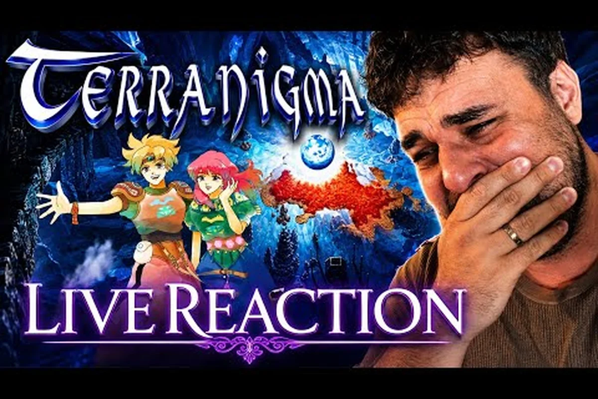
The Terranigma official art gallery represents one of the most visually striking collections to emerge from the 16-bit era, though Western audiences rarely got to experience it properly. Quintet's 1995 action RPG shipped with character designs from Kamui Fujiwara, whose clean linework and earthy color palette gave the game a distinct identity among Super Nintendo releases. With the 2027 re-release announced by Clear River Games, a new generation will finally see why the Terranigma SNES box art and in-game pixel work remain reference material for retro visual analysis.
Why the Terranigma Box Art History Still Captivates Collectors
The Terranigma box art history is a story of regional divergence that frustrated collectors for nearly three decades. Japanese players received a cover that emphasized Fujiwara's character illustrations, while PAL territories saw variations that shifted the visual tone entirely. This split created a fragmented collector's market where certain editions became far rarer than others.
| Region | Publisher | Year | Box Art Style | Collector Rarity |
|---|---|---|---|---|
| Japan | Enix | 1995 | Illustrated character montage | High |
| Germany | Nintendo | 1996 | Darker, abstract sky motif | Very High |
| United Kingdom | Nintendo | 1996 | Shared PAL layout, localized title | Medium |
| Spain | Nintendo | 1996 | PAL variant with unique border art | High |
The Japanese release leaned heavily into the Kamui Fujiwara art style, placing Ark and supporting characters prominently against a swirling cosmic backdrop. PAL regions, however, received a more atmospheric cover that prioritized the game's environmental themes over character close-ups. According to community collector data, sealed German copies regularly command premium prices because the printing run was comparatively small and the cover art diverged from the standardized PAL template.
Collectors seeking a complete Terranigma SNES box art set face a unique challenge that extends beyond simple regional availability. The game never launched in North America because Enix had closed its US subsidiary, which means no NTSC box variant exists at all. This absence makes the PAL and Japanese editions the only official physical covers, and it explains why the visual identity of the game feels distinctly European to many retro enthusiasts.
Deconstructing the Terranigma Pixel Art Analysis
A proper Terranigma pixel art analysis starts with understanding how Quintet pushed the Super Nintendo hardware beyond its typical constraints. The game uses layered sprite scaling, transparency effects, and a muted-but-rich color range that distinguished it from the brighter, more saturated RPGs of the same period.
Character Sprite Construction and Animation Cycles
Fujiwara's character designs translated into surprisingly detailed in-game sprites, especially for Ark's movement cycles. The walking animation alone uses multiple unique frames that vary by terrain type, a detail that many players miss because the motion feels so natural.
| Sprite Element | Technical Detail | Visual Effect |
|---|---|---|
| Ark's run cycle | 6 distinct frames per direction | Fluid weight shift during turns |
| Enemy idle states | 4-8 frames with sub-pixel movement | Organic breathing, not static placeholders |
| Environmental tiles | 3-layer parallax scrolling | Depth without Mode 7 overuse |
| NPC portraits | Hand-touched 16-color indexed art | Preserves Fujiwara's line quality |
The pixel art analysis reveals that Quintet prioritized readability over raw detail, which is why the game still looks coherent on modern displays despite running at the SNES native resolution of 256x224. Community modders who have extracted sprite sheets note that many backgrounds use dithering patterns that only resolve correctly on CRT displays, creating a fascinating gap between intended and emulated presentation.
The Role of Limited Color Palettes
The game's restricted color space forced deliberate artistic choices. Dark side environments in Crysta use cold blues and muted grays, while the resurrected surface world introduces warm greens and golden light. This narrative color coding works because the art team committed to a consistent palette hierarchy across all five tower regions.
A significant part of the visual identity comes from how the game handles light sources in interior spaces. Rather than relying on simple brightness adjustments, Quintet layered semi-transparent sprite overlays that simulate lantern glow and shadow falloff. Players who examine the official art gallery scans side-by-side with gameplay captures will notice how closely the in-engine rendering matches Fujiwara's original painted mood boards.
The Terranigma CRT Filter Debate: Authenticity vs. Modern Displays
The Terranigma CRT filter discussion has intensified since the 2027 re-release was announced, because modern ports must decide how faithfully to reproduce the original display characteristics. Playing on a flat-panel monitor without any filtering reveals harsh pixel edges and dithering artifacts that were invisible on the consumer CRT televisions of the mid-1990s.
How CRT Displays Transformed the Original Artwork
The physics of a cathode-ray tube changed the visual output in ways that digital displays cannot naturally replicate. Scanlines, phosphor bloom, and the slight color bleed between adjacent pixels acted as a natural anti-aliasing layer, smoothing the transition between sprite edges and background tiles.
| Display Type | Pixel Presentation | Color Accuracy | Perceived Detail |
|---|---|---|---|
| Original CRT (1995) | Soft edge blending, visible scanlines | Warm, slightly oversaturated | High perceived smoothness |
| Modern LCD/OLED (raw) | Hard pixel edges, no scanlines | Accurate but cold | Lower perceived smoothness |
| Emulator + CRT shader | Simulated bloom and scanlines | Approximates original warmth | High perceived smoothness |
| Switch OLED (port) | Sharp integer scaling, optional filter | Balanced, developer-tuned | Medium-to-high smoothness |
Community testing with crt filter shaders such as CRT-Royale and Guest-Advanced shows that the game's background dithering resolves into smooth gradients when the filter parameters match the original display's shadow mask pattern. Players who grew up with the PAL release often describe the raw pixel look as "wrong," while newcomers frequently prefer the sharper presentation because it exposes details they never noticed on old hardware.
The 2027 Re-release Visual Strategy
Clear River Games has confirmed through the official Steam store listing that the re-release will feature upgraded presentation options, though specifics remain under wraps. The involvement of original artist Kamui Fujiwara in creating new official artwork suggests the port will include a gallery mode with both archival scans and newly commissioned pieces.
Terranigma Visual Comparison SNES vs Switch: What Actually Changes
A Terranigma visual comparison SNES vs Switch requires separating three distinct layers: the original asset resolution, the rendering pipeline differences, and the display output chain. None of these layers changed the core artwork, but each one affects how players perceive that artwork.
Rendering Pipeline Differences
The SNES rendered everything through its dedicated PPU at a fixed internal resolution, outputting an analog signal that the television interpreted. The Switch renders the same assets through an emulation layer that must either integer-scale the original frame or apply filtering to fit the 720p or 1080p output target.
| Aspect | SNES Original (1995) | Switch Re-release (2027) |
|---|---|---|
| Internal resolution | 256x224 native | 256x224 core, upscaled |
| Frame output | 60Hz interlaced | 60Hz progressive |
| Pixel scaling | None (analog) | Integer or bilinear options |
| Color space | CRT-tuned NTSC/PAL | sRGB calibrated |
| Sprite filtering | None (phosphor smoothing) | Optional smoothing filter |
| Scanline simulation | Native via CRT | Software shader option |
The visual comparison becomes most apparent in scenes with heavy parallax movement. On the SNES, the three background layers moved at slightly different speeds and the CRT's persistence of vision blended the transitions. On a modern Switch display, those same layers appear as distinct, sharply separated planes, which can feel more mechanical despite being technically more accurate.
What Community Capture Tests Reveal
According to community data from side-by-side capture tests, the Switch version preserves the original sprite dimensions and animation timing exactly, with no dropped frames or altered movement speeds. The primary visual difference is in edge definition and color temperature, both of which can be adjusted through the re-release's expected display settings.
Players who want the closest experience to the original PAL release should pair the Switch version with a CRT filter profile that emphasizes scanline thickness over bloom, because European PAL televisions had more visible scanline structure than their NTSC counterparts. The Terranigma intro video breakdown examines how the opening sequence's art direction shifts between these display contexts.
Preserving and Accessing the Terranigma Official Art Gallery Today
Accessing the Terranigma official art gallery has historically required hunting through Japanese strategy guides, promotional booklets, and magazine spreads from 1995. The re-release announcement indicates that this archival material will finally become widely available through an in-game gallery feature, but details about which pieces will be included remain unconfirmed as of August 2026.
Known Sources of Official Artwork
Before the digital gallery launches, collectors and fans have pieced together a de facto archive from multiple physical and digital sources, including Japanese magazine scans from 1995, the original Super Famicom box art, Kamui Fujiwara's later official art contributions, and screenshots preserved by the emulation community. Each source contributes a different slice of the overall visual record.
-
Japanese strategy guide scans contain the largest collection of Fujiwara's painted illustrations, including environment concept art that never appeared in promotional material.
-
PAL-era magazine advertisements feature alternate box art compositions and character poses not seen elsewhere.
-
The Steam store page for the 2027 re-release includes newly digitized key art that previews the gallery's presentation quality.
-
Clear River Games' official site hosts the announcement trailer and press kit materials with high-resolution logo and artwork assets.
The Terranigma rebirth trailer video includes several frames that community members have already identified as restored scans from the original art archive, suggesting that the digital gallery will prioritize faithful reproduction over reinterpretation. That distinction matters for preservation-minded fans, because faithful scans keep Fujiwara's linework and the original color grading intact rather than smoothing them into a modern house style.
What Makes This Gallery Different from Typical Retro Collections
Most retro re-releases treat art galleries as a bonus menu, but the Terranigma official art gallery carries additional weight because the game's Western release was so limited. Fans in North America never saw the original marketing campaign, never owned a physical box, and never experienced the full scope of Fujiwara's promotional illustrations. The gallery functions as an archival restoration project as much as a fan service feature.
Frequently Asked Questions
What makes the Terranigma official art gallery unique among SNES-era collections?
The gallery is significant because it consolidates artwork from a game that never received a North American release, meaning most Western players have never seen the full promotional illustration set. The involvement of original artist Kamui Fujiwara in the 2027 re-release adds archival authority.
Why did the SNES box art differ so much between Japan and Europe?
Regional publishers made independent marketing decisions: Enix of Japan used Kamui Fujiwara's character illustrations to sell the narrative tone, while Nintendo of Europe chose atmospheric environmental covers emphasizing the resurrection of continents via five towers. This split created the fragmented PAL and NTSC-J collector's market, with re-release artwork now bridging both visual identities.
Does the CRT filter actually change how the pixel art looks?
Yes, significantly. The original dithering patterns and semi-transparent overlays were designed for CRT phosphor behavior, which naturally blended adjacent pixels. On raw digital displays these patterns appear as visible checkerboard artifacts, while a proper CRT filter restores the smooth gradients.
Will the Switch version look exactly like the SNES original?
Not exactly, but the core artwork remains unchanged. The Switch version renders the same sprites and backgrounds at higher clarity, with optional filters to approximate the original display characteristics. Color temperature and edge definition differ unless display settings are adjusted.
Where can I find official Terranigma artwork before the re-release launches?
Before the re-release launches, check the Terranigma Steam page for newly digitized key art, plus Clear River Games’ Pixel Arcadia announcement materials for high-resolution promotional assets. Japanese strategy guide scans and PAL-era magazine ads remain the best archival sources for original Kamui Fujiwara artwork.